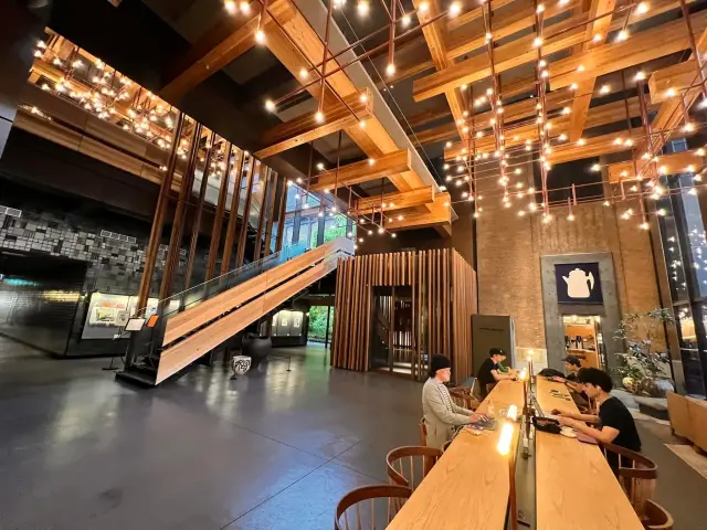
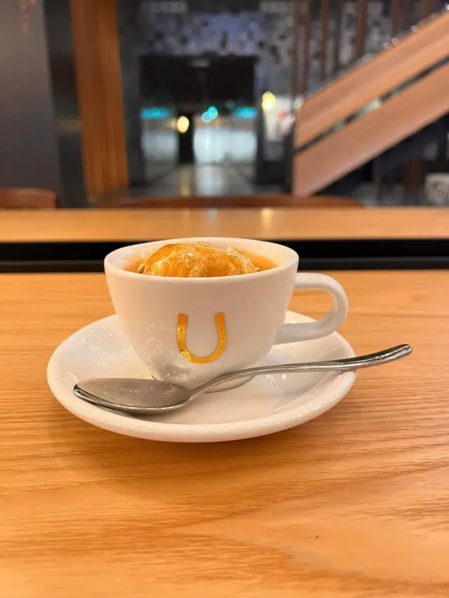
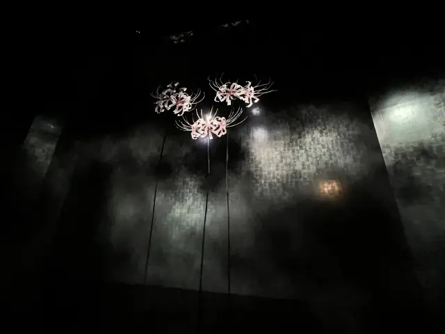
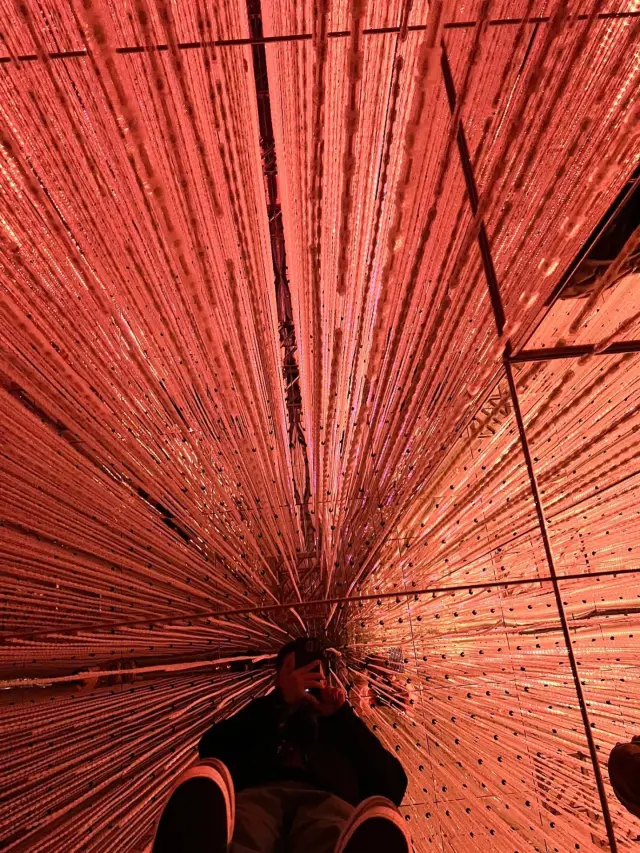
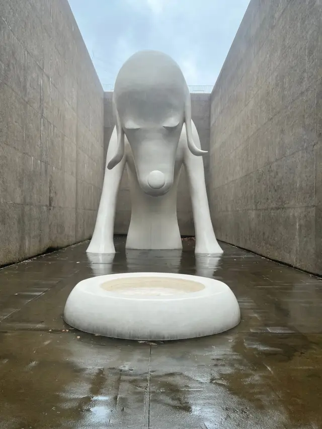
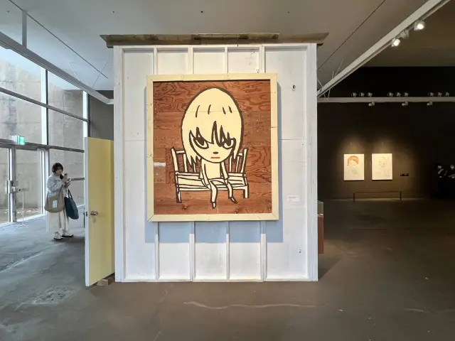
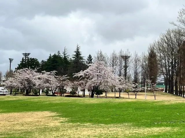
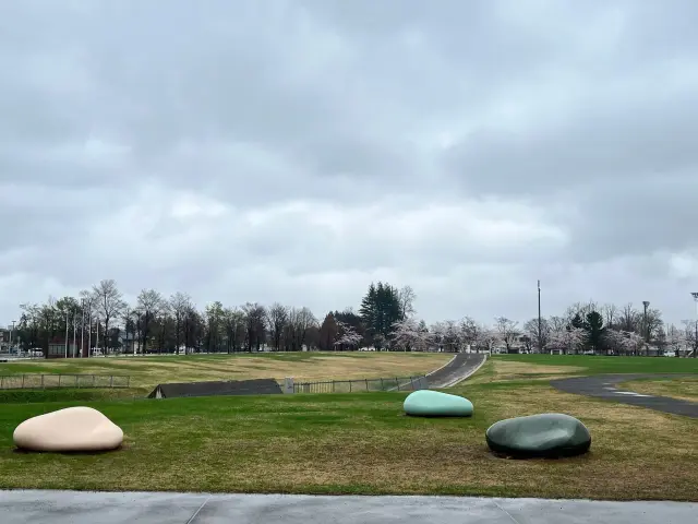
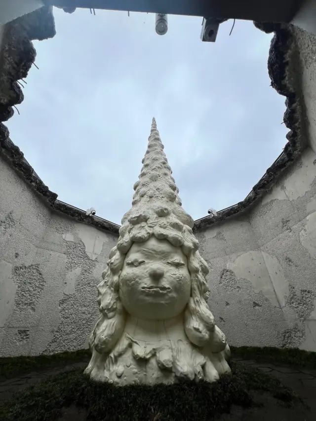
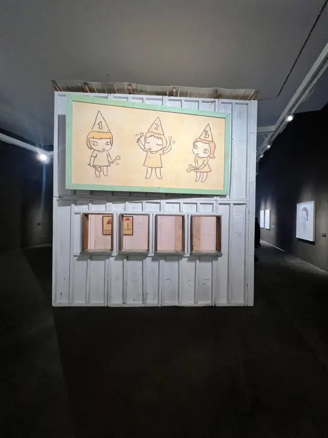
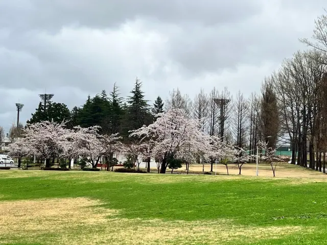
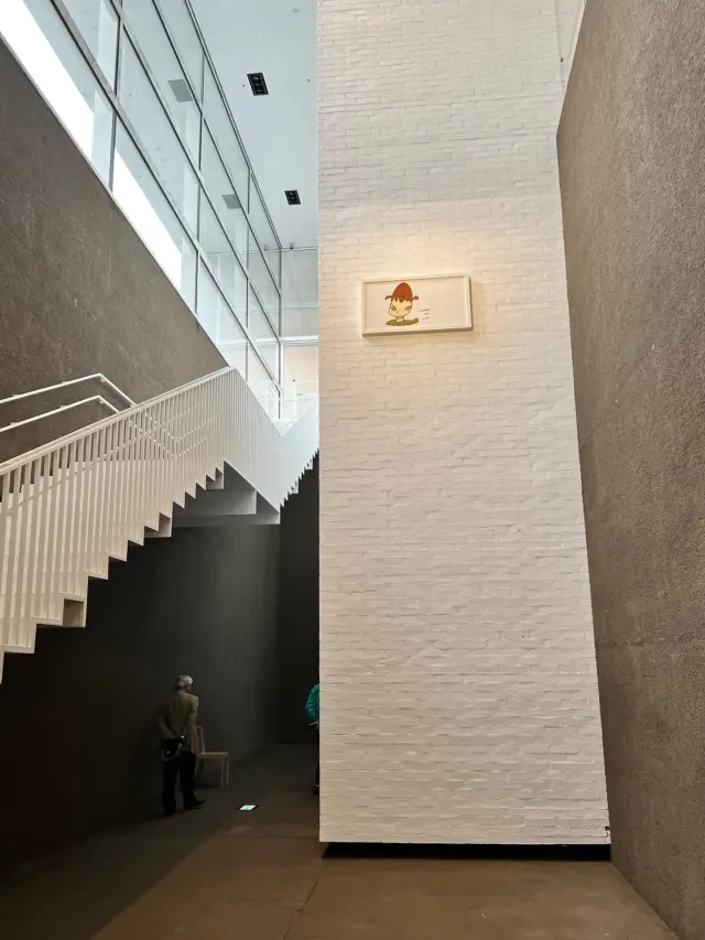
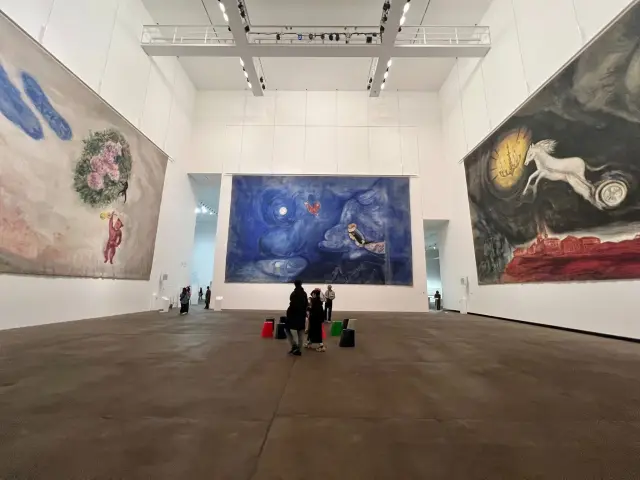
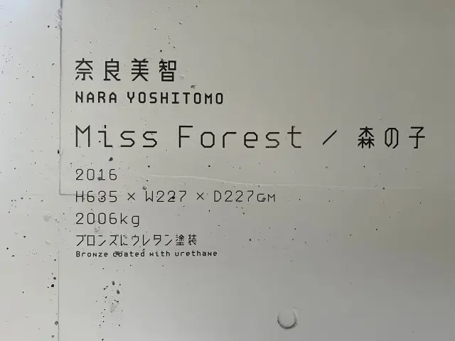
I came for Yoshitomo Nara, and seeing the Aomori Dog in person was incredibly moving 🥹 I was pleasantly surprised to find that, besides these works, the other exhibitions and the architectural design are also well worth a visit!
Special discovery:
The Aomori Museum of Art's original typeface is called Aomori Font, designed by Tokyo graphic designer Atsuki Kikuchi.
Typeface design features
Simple elements: The typeface is mainly composed of vertical lines, horizontal lines, and 45-degree diagonal lines, giving it a simple, modern look.
Echoes the architecture: The design concept is closely tied to the museum's architecture, and together they create the museum's distinctive visual identity.
Visual identity system: This typeface is used not only on the museum's official website, but also consistently throughout the museum for signs, directions, and explanatory text, creating a distinctive and recognizable identity.
Triangular logo
Inspiration: In addition to the typeface, Atsuki Kikuchi also designed a triangular logo for the museum, inspired by the letter “A,” the first letter of “Aomori,” and the character “木,” meaning tree, which represents Aomori.
Neon design: This triangular logo is made up of countless neon lights. They light up in blue-green 30 minutes before the museum closes, and the repeated patterns and lighting effects together create an image of “Aomori.”
Aomori Museum of Art | Review by Norton Liang
Other Reviews by Norton Liang
-

ShinPuhKan
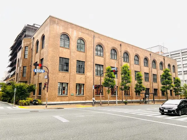
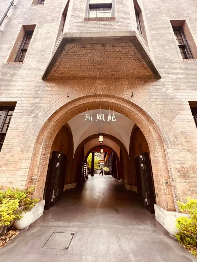
The ShinPuhKan, a commercial facility in Karasuma Oike, reopened in 2020, blending historical architecture with new construction. The brick-built "Preserved Building" is a renovated structure of the old Kyoto Central Telephone Office from 1926, designated as Kyoto City’s first registered cultural property.
Popular shops and spaces that artsy types shouldn't miss
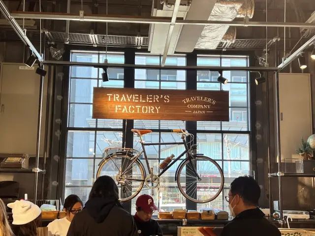
• TRAVELER'S FACTORY KYOTO: The Kyoto branch of the popular stationery store from Nakameguro, Tokyo, selling a variety of planners, washi tape, notebooks, and Kyoto-exclusive items, with customization services also available.
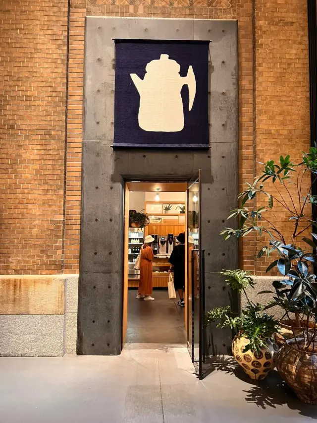
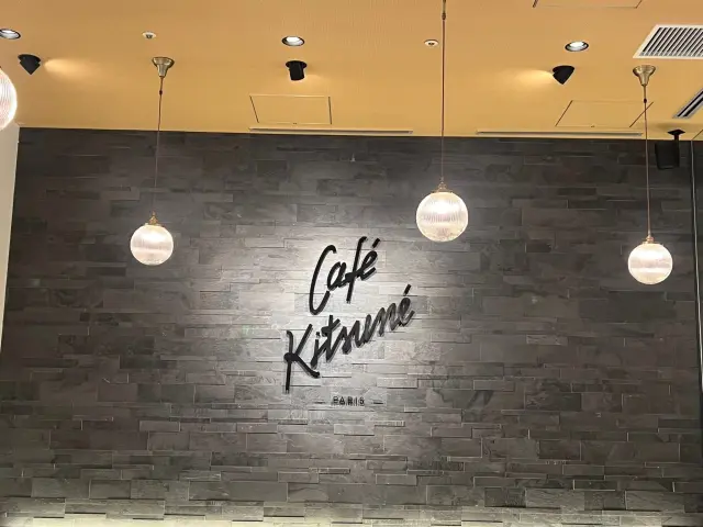
• Café Kitsuné: A hugely popular, stylish fox-themed café from Paris, located on the first floor of ShinPuhKan, with a refined blend of French and Japanese aesthetics.
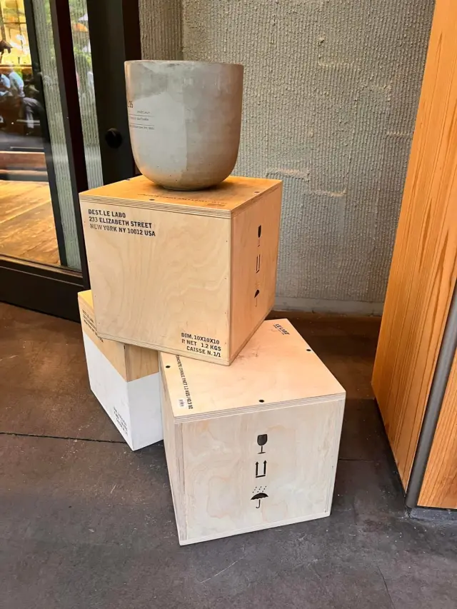
• LE LABO: A New York artisanal fragrance brand known for its vintage laboratory style, with an exceptionally sophisticated store design.
• (THISIS)SHIZEN: A multipurpose space centered on nature, craftsmanship, and art. Its best-known signature item is edible-flower ice cream that looks like an elegant bouquet.
• Ace Hotel Kyoto: A trendy boutique hotel brand that originated in Seattle, making its first entry into Japan. The public lobby and overall design are filled with art and music.
• アップリンク京都 (UPLINK Kyoto): An intimate independent movie theater on the first basement floor, popular with film buffs and artsy types. -
-
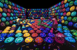
teamLab Biovortex Kyoto
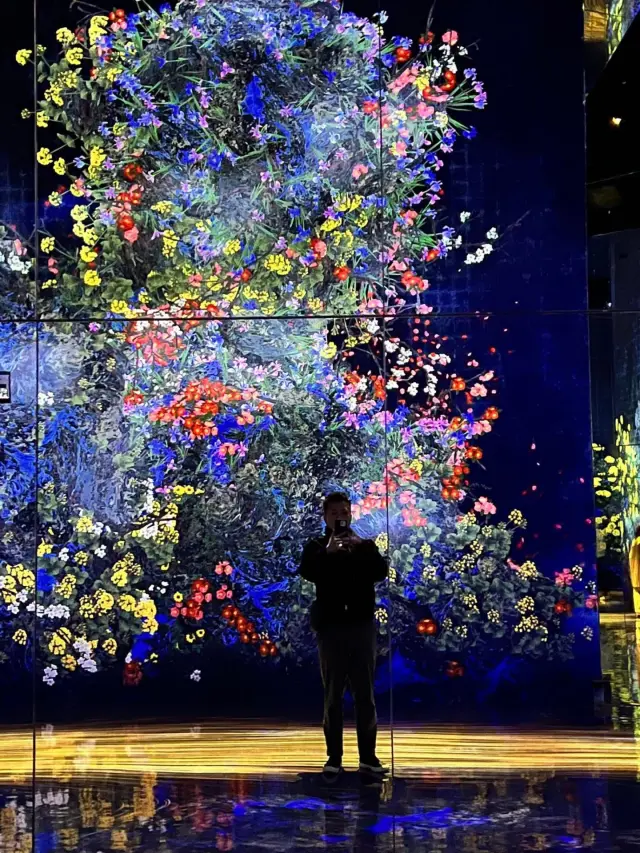
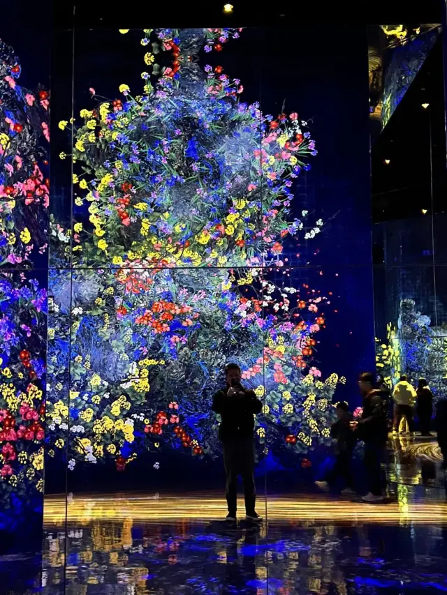
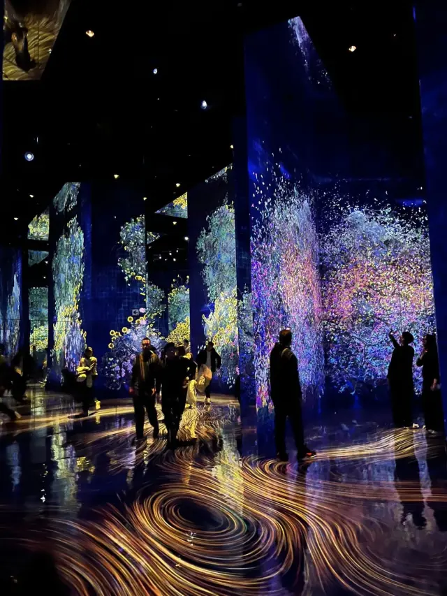
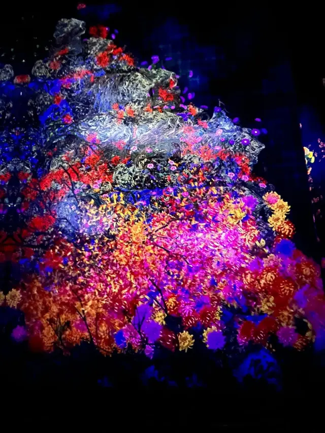
Opened in October 2025 in the southeastern area of Kyoto Station, this is teamLab’s newest museum. Using advanced digital technology, it showcases immersive artworks that transform in response to human presence and movement, displayed across Japan’s largest teamLab space, covering approximately 10,000 square meters.
The core design concept of teamLab Biovortex Kyoto is “Biovortex,” which combines “life” and “vortex.” It emphasizes that “the environment gives rise to phenomena, and phenomena create existence,” creating an art experience filled with sensory perception where visitors can fully immerse themselves, interact with the works, and co-create a world that is “boundaryless, selfless, and eternal.” It also cleverly echoes Kyoto’s garden culture, exploring the themes of “existence” and “environment.”
Core design concepts:
Biovortex: The exhibition is presented as a continuously flowing and changing field of energy, symbolizing the cycle of life and allowing visitors to sense the interconnectedness of all things.
Environmental phenomena: The works are not fixed objects, but dynamic phenomena produced through the environment—light, sound, scent, and interaction—challenging our perception of “existence.”
Boundarylessness and immersion: The boundaries between the artworks and visitors are blurred, allowing visitors to become part of the art and experience and create through all their senses.
Once-in-a-lifetime encounter: The works change in real time through interactions among time, space, people, and the environment, creating a unique experience in each moment.
Universal design: With no national or language barriers, everyone can enjoy the art intuitively.
Connection to Kyoto:
Garden concept: The entrance is modeled after a Kyoto garden and planted with Kitayama daisugi and other plants, blending digital art with the natural landscape.
Cultural dialogue: Modern technology is used to interpret Kyoto’s historical depth and vitality.
Presentation methods:
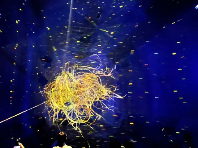
Non-material sculptures: Soap bubbles form and spheres of light float, presenting art forms with no fixed boundaries that can repair themselves.
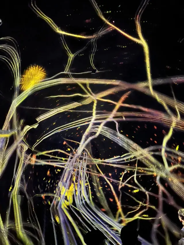
Interactive co-creation: For example, visitors’ footsteps connect to form a massive living organism in Traces of Life, with their actions directly generating the work.
Large-scale new works: Large interactive installations such as Flow of Life and Eternal Universe of Words are displayed, creating a grand sense of life. -
-

Kyoto Takashimaya S.C.
Perched on the southwest corner of the bustling Shijo Kawaramachi intersection in Kyoto, this large-scale retailer keeps a long and bold history since its infancy as the “Takashimaya” vintage clothing cotton merchant that founded in the local year of Tempo 2 (1831). The brand moved to Kawaramachi-Takatsuji as the first privately-owned, reinforced concrete commercial building during the Meiji era in 1912, and has since then moved to its current spot as a market center in 1946.
Besides all the must-buy souvenirs on the basement floors,
I personally highly recommend these must-visit spots for artsy types:
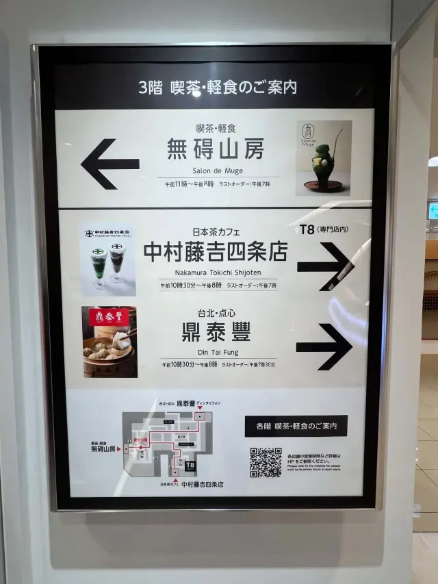
Several noteworthy and trendy stores and facilities inside Kyoto Takashimaya S.C. (especially the T8 building/new wing). Here is a brief introduction to the three distinctive must-visit spots you listed:
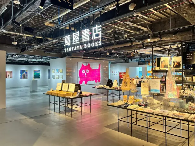
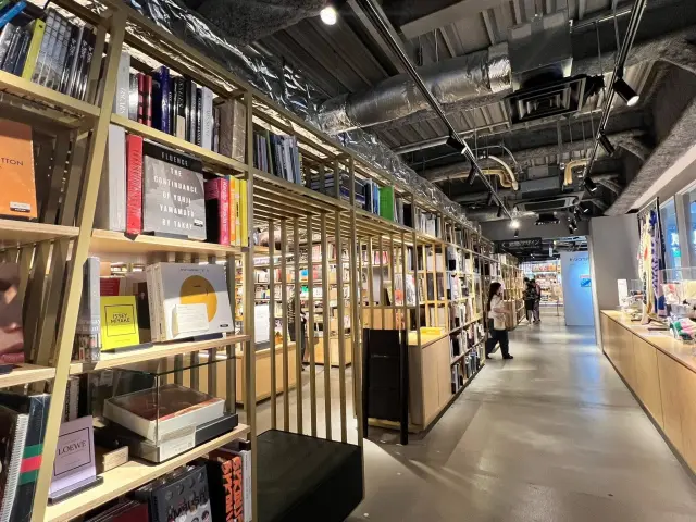
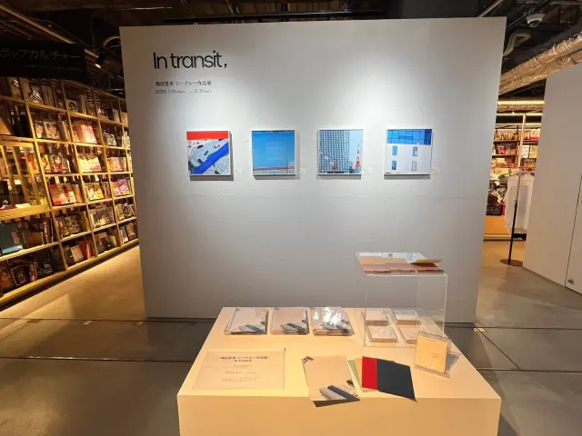
* Kyoto Tsutaya Books (TSUTAYA BOOKS / Photo 3)
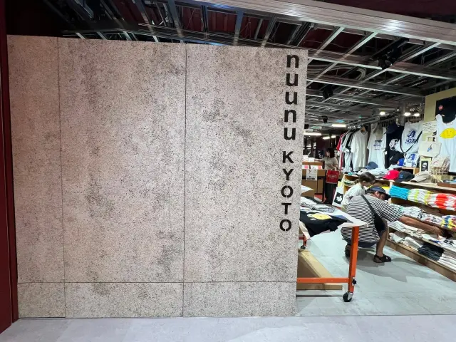
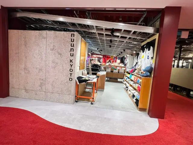
* Introduction: Located on the 5th and 6th floors of Kyoto Takashimaya S.C. T8, this Tsutaya bookstore combines art, Japanese culture, and lifestyle aesthetics. In addition to its extensive selection of books, it frequently hosts exciting exhibitions by contemporary artists and sells unique artwork, designer goods, and Kyoto-exclusive merchandise. It is a landmark destination in Kyoto for artsy visitors and art lovers.* nuunu KYOTO
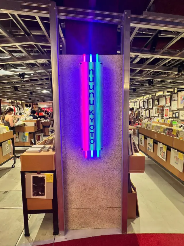
* Introduction: This is a select shop/concept space filled with unique street fashion and subculture style (often complementing the floor where Tsutaya Books is located and the surrounding arts and cultural spaces). It sells distinctive clothing, T-shirts, specialty goods, and art-related merchandise. You can often uncover cool items full of creativity and local design, making it a must-visit for trend lovers and anyone looking for unique souvenirs.
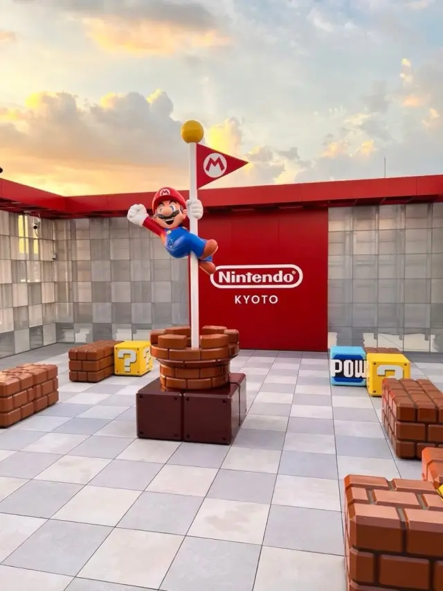
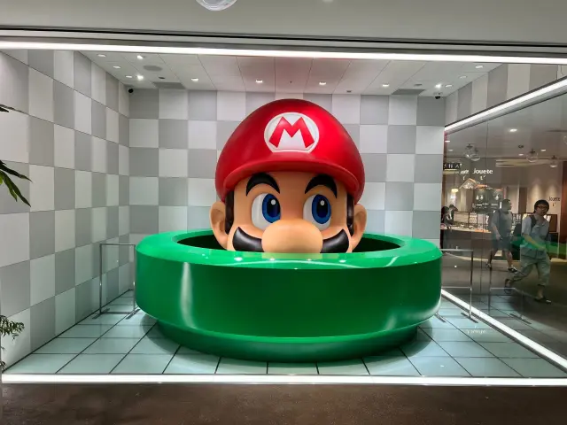
* Nintendo KYOTO-related displays/area (giant Super Mario decoration)
* Introduction: Although the official Nintendo KYOTO store itself is located inside the Kyoto Takashimaya T8 building next to Kyoto Takashimaya S.C., the complex often features large photo spots with classic characters such as Mario (like a giant Mario head poking out of a pipe). It is an excellent spot for fans to make a pilgrimage and take commemorative photos, and the store also sells a variety of exclusive Nintendo character merchandise.
If you're planning your itinerary, these places are all in the same mixed-use complex as Kyoto Takashimaya S.C. (T8) or right next to it, making them perfect to visit together for shopping, photos, and experiencing Kyoto's contemporary new appeal! -